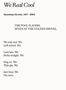
 “Compare two presentations of We Real Cool by Gwendolyn Brooks: first, the single most widely accessible edition of the poem, on a page of her 1963 Selected Poems published by Harper & Row, and second on the 1966 broadside published by Broadside Press. The words, in a formal linguistic sense, remain the same, but the material presentation does not. Those physical qualities, as a necessary condition for reading the poem, as an unavoidable part of the thing read, create a different set of meanings in each artifact.
First consider the book version. . . . [The pool players’] first dramatic line, “We real cool,” repeats the title, a complete Black English sentence, and it suggests an interpretation of what follows: these actions are manifestations of coolness. The non-standard grammar of the title and first line transgresses the normal decorum of English language poetry, showing the social distance between the pool players and the middle class subjects of much of our poetic canon. The second sentence, “We / Left school,” establishes what I will call the moral relationship between the players and the literate reader, buyer of poetry books. This reader knows they shouldn’t do that–knows better than they do that this first manifestation of their coolness will surely harm them, as it eventually does. . . .
The simple, but strong and regular rhythm, reinforced by the jarringly nonstandard grammar, creates a sense of energy and aggressive physical power. But in the end, rhythm and syntax contain and finally cut off that vitality. The word “We” begins each short subject-predicate sentence and ends each line but the last. To maintain the syntactic pattern, the last line ends on the predicate, ‘Die soon,’ omitting the final ‘We.’ The predominant rhythm of the poem–two strong beats, one weak beat–resolves (satisfyingly) on the two strong beats in the last line. These two patterns, syntactic and rhythmic, converge to eliminate the final ‘We.’ The group dissolves in the last line, ‘Die soon,’ the final consequence of coolness, of energetically rejecting the middle-class respect for education. This satisfying little tragedy confirms the dominance and the rightness of values foreign to the players themselves. By the end, they are completely powerless, dead.
. . . But what would an increased attention to visual design add to this reading? Can we find here a stronger value in the whiteness of the paper and the blackness of the ink . . . a metaphorical reading of color . . . a critique of humanist assumptions in whiteness as a universal standard of legible space–ubiquitous, non-contingent whiteness–and black as a differentiation upon it? The very conventionality of the white page denies that it carries any such meaning. . . .
The elegance of the typeface and the evenness of the layout in Selected Poems are products of craftsmanship, so well produced that they are refined out of notice. That particular grace and craft are from a world outside the pool hall. . . . The speech is first person, but the studied aesthetics of the type does not emerge from the aesthetic values of the pool-playing dropouts who are supposedly speaking. . . . The alternative aesthetic of pool hall cool in the language of the poem thus is reshaped to fit the Procrustean bed of book design. The (aesthetic) values of the (white) middle class prevail.
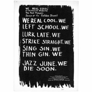
The broadside version appeared in 1966, when Brooks was becoming more radically engaged in racial politics. . . . The design inverts the most pervasive printing convention of all into white lettering on a black field. . . . This is not the even, neutral, potentially infinite space of the white page; here the field of discourse is itself the inked intrusion. . . . Language clears space in that field, exposing the white surface rather than concealing it. By creating an unconventional relationship between ink and paper, this broadside makes that relationship legible. It raises the question of whether that more conventional book page works any differently, whether the familiar habits of book design are any less contingent in their composition or more innocent of meaning themselves.
. . . [T] he broadside ‘We Real Cool’ privileges the title, byline, and dramatic exposition . . . by placing them at the top, but it prints them in smaller letters than the body of the poem. Considered as an image also rather than only as a poem, it privileges the large figures in the center, the letters that represent the speech of the pool players; the small figures above and below–the otherwise controlling dramatic, literary, and publishing context–are subordinate.
It looks like either a chalkboard or graffiti. The refined transparencies of classical typography and the printed, bound pages of a well-produced hardcover book would not be available for these pool players to use to speak for themselves. As chalkboard writing, it appears in a setting familiar, if uncongenial, to the pool players. These are the rough letters they can make themselves in order to speak in a setting that has been available to them. Appearing thus so brazenly in the school setting that the pool players themselves have rejected, this text is an empowering nose-thumbing at the institution that once controlled and restricted them–thus, also, a rejection of the school-values that would interpret the poem as an endorsement of education. As graffiti, the poem is an anonymous, unregulated, transgressive utterance, not the work of that contained, knowable, critically manageable construction, the imagination of the poet.
Sullivan, James D. On the Walls and in the Streets: American Poetry Broadsides from the 1960s. Urbana: U of Illinois Press, 1997.